Thursday Turn Out - 1/29/2026

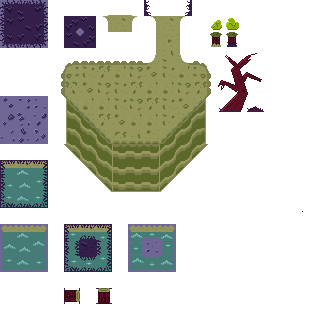
It’s amazing what a week off of work will allow one to accomplish. I used last week’s terrain sketch and mood scene to create an initial tileset for the Place Just Beneath. By “initial,” I don’t mean “first tileset I made for Just Beneath the Holler,” I mean “first tileset containing reasonable detail and coloring, ever”. The previous tilesets I’ve made have consisted of colored blocks, some of which included the extra detail of lettering. I’d like to say I had a good reason for including the lettering at the time, but my thought process was likely some variation of “now I’ll know which tiles are which because the color didn’t differentiate them enough”. Here’s JBtH’s first tileset:
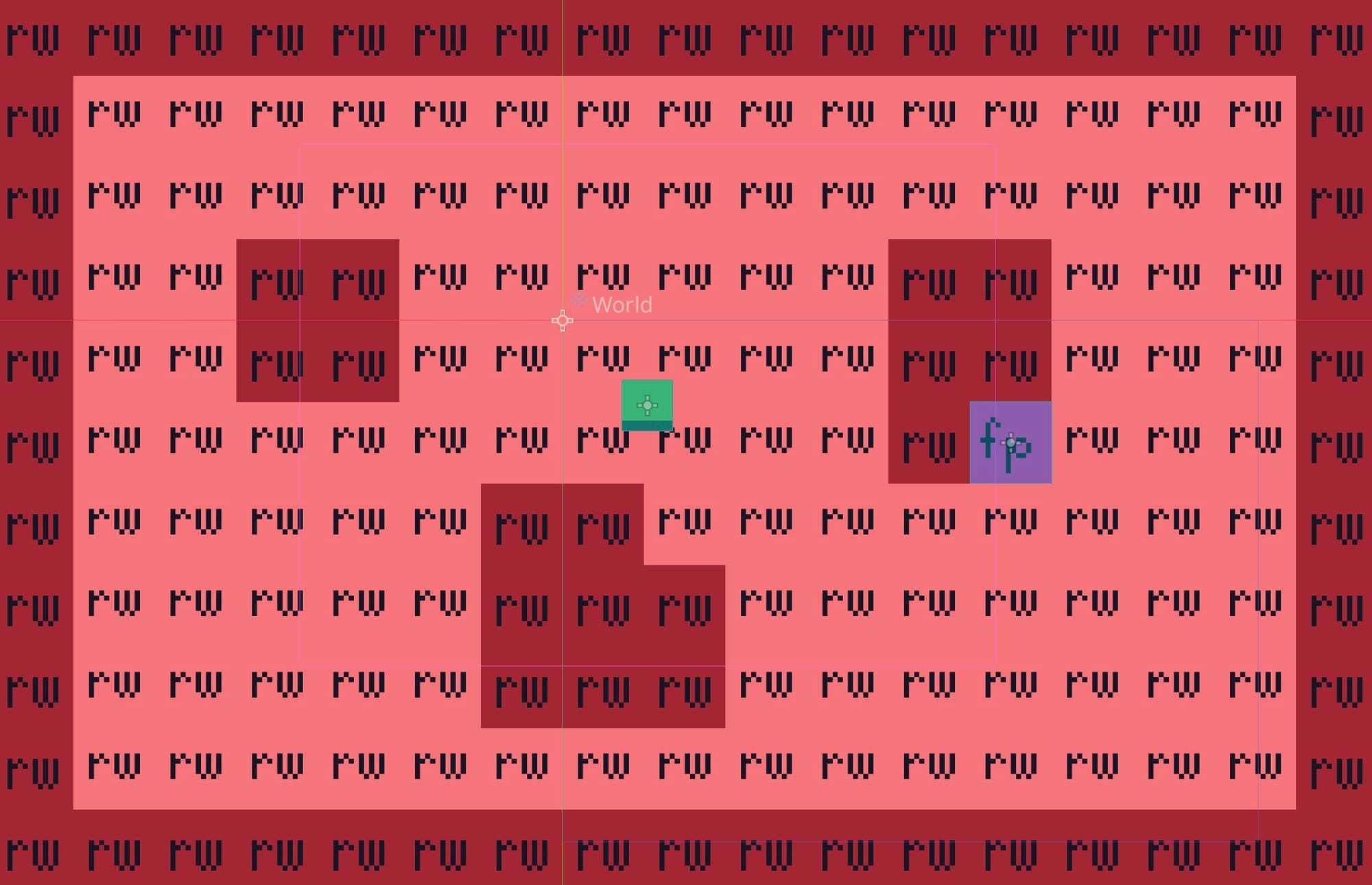
And this is what I accomplished this week:
I can’t help but be impressed with myself. This tileset is a long way from where I want the finished art to be, but it’s a longer way from where I started. That’s real progress and there’s no point in devaluing the hard work and research I put into the tileset to make that progress possible. I had to learn an entire new program (Aseprite) and take a crash course in color theory to get here.
My advisor told me, as his PhD advisor told him, that a doctorate is nothing more than a license to do science. While I don’t think my advisor envisioned that my degree in physical chemistry would have led me to creating my own game, the research skills and diligence I developed during my years in graduate school are transferable and have served me well.
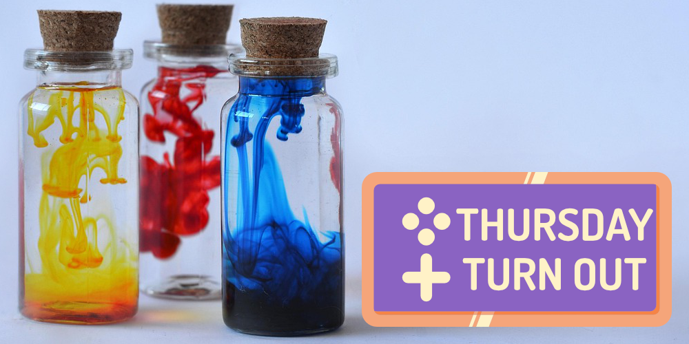
I didn’t just work on the tileset this week. I’d been using the same logo for all three types of posts here as well as for my podcast (which you should listen and subscribe to, it’s five minutes a day because we’re both busy!). Yes, each one had different words, but we’re programmed to differentiate colors and shapes first. In the ever-scrolling world of social media, it was too easy for those four, technically distinct images to fade into the “I’ve already seen this” background. Also, the pixelated font was getting on my nerves.
I created four new images, as well as new logos for this site, my Facebook page, and YouTube channel. You’ve already seen the new images for Monday Map Outs, Thursday Turn Outs, and the podcast. You’ll see the new image for Sunday Show Outs on, and this may come as a complete surprise, Sunday. I like the new icons: they’re distinct while still maintaining my identity.
It’s been a productive week, but I’m ready to get out of the house today. Maybe I’ll grab some lunch, maybe I’ll get a coffee, maybe I’ll just walk through the grocery store aisles and dissociate amongst the cereals. After that, I’ll fire up Godot and use this tileset to create a new, sprawling level in which to incorporate the infinite-scrolling code. I’d like to get that done by Sunday, but we’ll see.
As always, thanks for reading, and please subscribe!